One of the challenges of a scientist working with radar satellite imagery, who also wants to provide her products to the end-user community, is the final visualization of the results.
Representations of radar measures are usually black and white, blurry, distorted, speckled images. This is because radar instruments do not measure visible radiation, but -mainly- surface roughness. It is not like seeing something, it is more like touching it.
So how can we assign a color to that, in a way that it is also user-friendly?
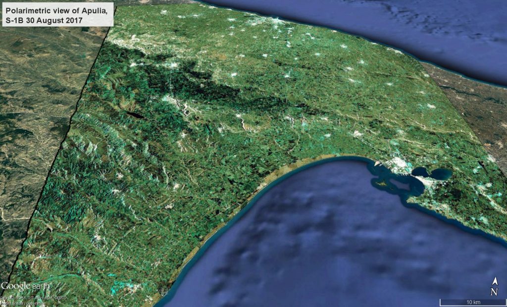
The combination of different polarimetric and time series variables can bring to RGB compositions that highlight specific properties of the targets to an expert user, as every color hold a precise physical meaning.
Non-expert users would appreciate more a combination of polarimetric channels as the one used for the image above, that shows a natural color palette.
First released: 22/09/2017
Contains modified Copernicus Sentinel data [2017], processed by Melchionna – Remote Sensing


